Using industry best practices for sales enablement, I developed a template for our weekly emails to our over 36,000 members designed to delight, inform and motivate to action. Every aspect of the email was strategically created according to the latest in compliance and accessibility requirements, format and user interface limitations such as word counts, preview and scroll positioning, copywriting best practices, and CTA buttons. The result of our work was - for the first time - an efficient and effective email marketing program at Climb Credit Union (Fmr, Sooper Credit Union) that achieved results that were so strong, we were asked to coordinate carefully with front-line representatives who were being overwhelmed with business.

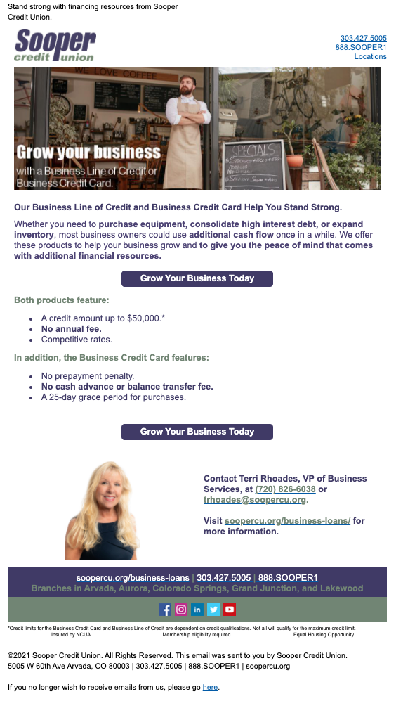
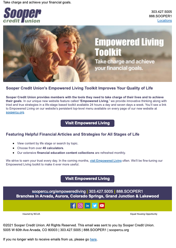
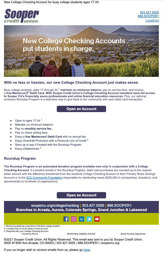
Striking header images - selected with an eye on diversity, equity, and inclusion - served to drive home our message at a glance immediately upon opening the email. Using A/B testing techniques, we experimented with a variety of CTA styles, finding that clever, creative, or simply unexpected wording received statistically higher click-through rates than the standard, "Click Here." My experience in high production short-form direct mail messages led to impactful "micro-stories" at the top of each email which then led down the page in a visual trail, punctuated by all-important CTA buttons visible as a scroll down continues. When appropriate, custom icons - within our brand style guidelines - were used to enhance memory or our messaging according to the latest in neuromarketing research.
The use of buttons was carefully monitored to avoid overload, and copy was, of course carefully planned to impact our target personas. Bolding was, generally, used for no more than 20% of the text to preserve maximum impact. The color palette of the email and mix of graphic elements was kept consistent to ensure readers that this was, in fact, a safe email. This was especially crucial during pandemic years when fraud attempts were at a fever pitch. Each line of business was given its own unique color mix - again - within the brand style visual guidelines I compiled for our marketing department.